Project Overview
Renata Terjeki | Pearl Stringer
Renata Terjeki is a specialist pearl stringer and antique jewellery restoration expert based in London. Despite an established reputation built over the past twenty years on word of mouth and a discreet, high-end clientele, her business lacked a solid brand identity and a cohesive digital presence.
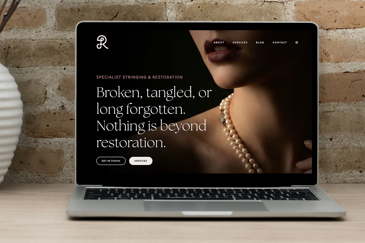
The project involved a complete brand strategy and custom website design to position Renata Terjeki as a leading name in pearl stringing and jewellery restoration. She sought an elegant, sophisticated, yet modern visual identity to convey trust, expertise, and the refined nature of her services without appearing dated or overly ornate.
The new brand and website support Renata’s ambition to strengthen visibility among international collectors, private clients, and industry professionals, and feel elegant and personal, with an intimate warmth and a confident character that reflect Renata’s work and the women she most often works with.
The Creative Process
A modern, sophisticated approach to revive a nearly forgotten art.
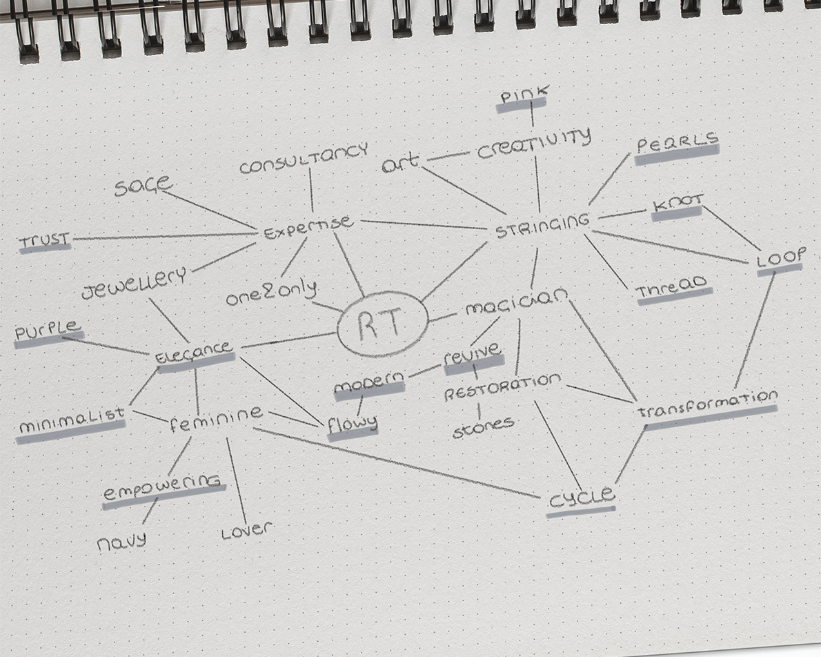
The brand strategy and visual identity began with an in-depth questionnaire and discovery phase to clarify Renata Terjeki’s mission, market position, and target audience. This foundation informed every decision, from tone of voice to visual direction.
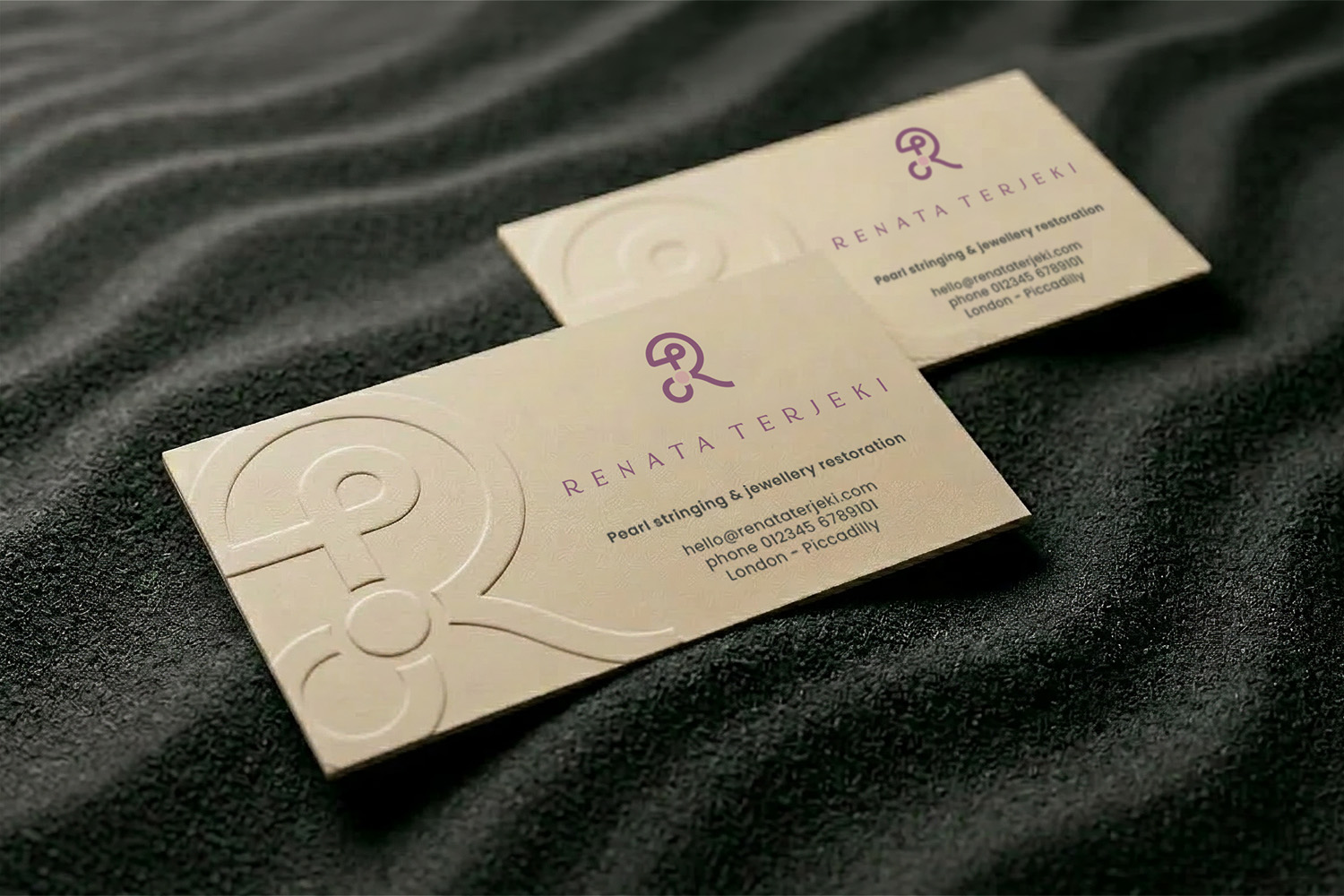
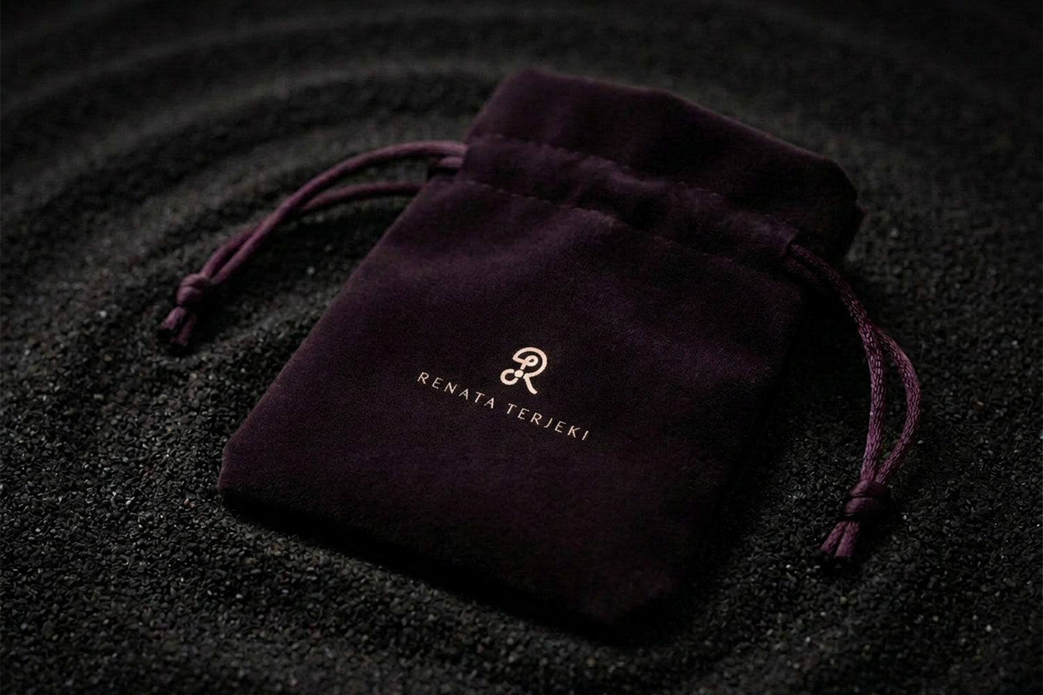
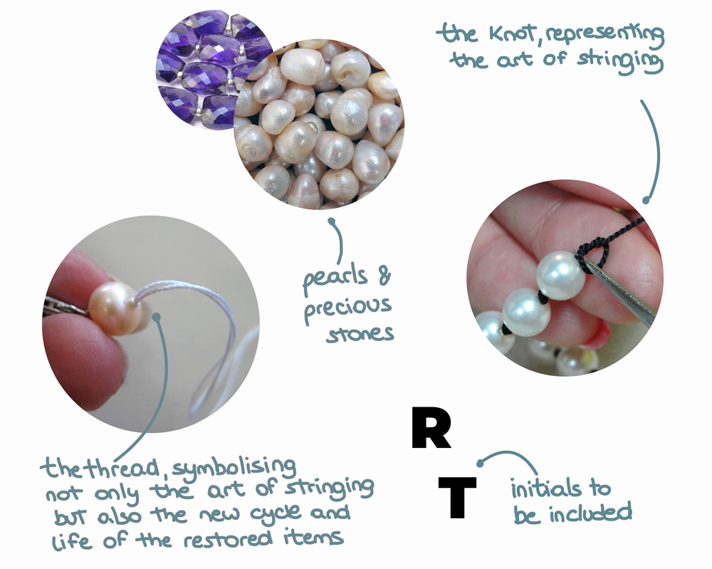
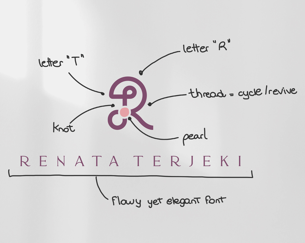
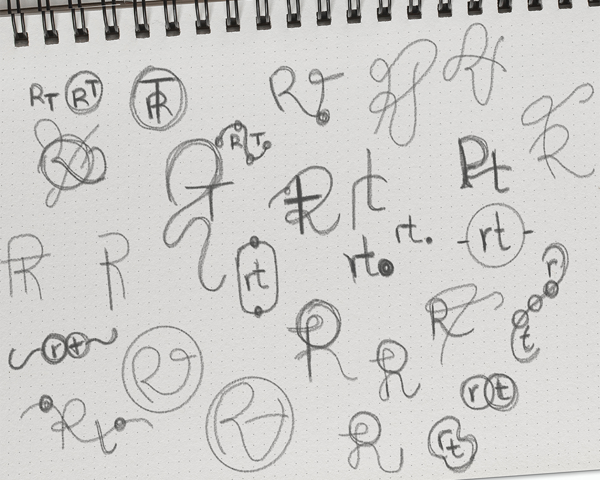
The new logo was conceived to be elegant, sophisticated, and distinctly feminine, speaking primarily to a high-end female clientele. It features not only Renata’s initials, but it also represents pearl stringing, and a sense of transformation and of new life that every piece is granted.
The website extends the same visual language, translating the identity into a seamless digital experience, emphasising Renata’s experience and services with elegance and warmth.

Typography & Colour Palette
Elegant yet minimalist typefaces and a feminine sophisticared palette
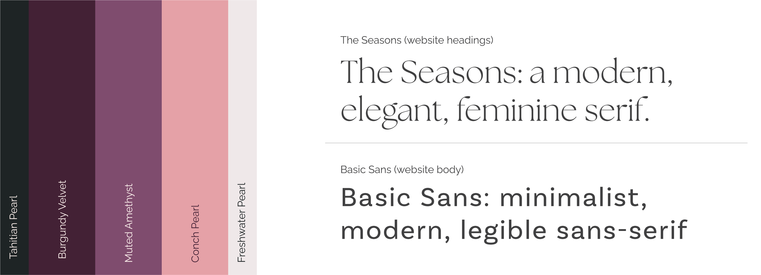
The visual identity combines a modern, feminine serif font with a minimalistic sans-serif. The Seasons has in fact the elegance and modernity the client was looking for, and perfectly pairs with Basic Sans that which is clean, legible, and minimalist. Together, the typefaces give the brand a polished editorial feel without relying on decorative or overly traditional luxury styling.
The colour palette brings together muted purple tones to represent elegance with darker ones that give the identity depth and richness. The accent pink adds a distinctly feminine note without making the palette feel sweet or overly delicate.
The combination feels minimal yet memorable, and provides a sophisticated foundation to present Renata’s services and expertise.